
Botanical Archive
A brand landing page for a craft hemp beverage company - built to attract wholesale partners, capture early orders, and signal "established brand" to investors before a nationwide October launch.
The Problem
The client was taking orders by hand - phone calls, farmers market walk-ups, DMs - with no web presence, no email capture, and nothing to show investors or wholesale partners. With a nationwide shipping launch on October 15 and international licensing conversations already in motion, they needed a site that looked like an established premium brand, not a startup. No page builder. No template. It had to feel like it belonged.
Try It
Previewing at tablet width. Open the full site ↗ for the desktop experience.
You're on mobile - open the full site ↗ for the best experience.
Mobile Experience
Mobile
Interactive 3D Model Viewer
The brand is pre-launch - no professional photography yet, no product shots. Rather than use placeholders, I built interactive Three.js 3D models for all three distribution formats: glass bottle, 12oz can, and draft keg. The goal was to be different. Most beverage sites show a flat hero image. This one lets you spin the product. It makes the page feel cutting-edge and signals to investors and partners that the brand is serious before a single can has been shot.
Animated Parallax Background
The background is a fixed full-viewport image that moves on scroll via a mousemove parallax offset. It also runs a continuous CSS breathing animation - slowly scaling and rotating between keyframes - so the page feels alive even when the user isn't interacting. The effect is tied to a filter pipeline (contrast, brightness, saturate) that shifts with the animation to enhance mood without overwhelming foreground content.
Scroll Shake & Reveal
The page is dense - creator story, product formats, methodology, FAQ, licensing, two forms. On a page with that much content, a customer clicking a nav link needs to know exactly where they landed. The shake animation on each section answers that: when you click "Product Formats," the section rattles for half a second so your eye goes straight to it. No confusion, no hunting. Sections also fade and slide in on scroll via IntersectionObserver, so the page feels alive as you move through it rather than dumping everything at once.
Zine-Style Editorial Design
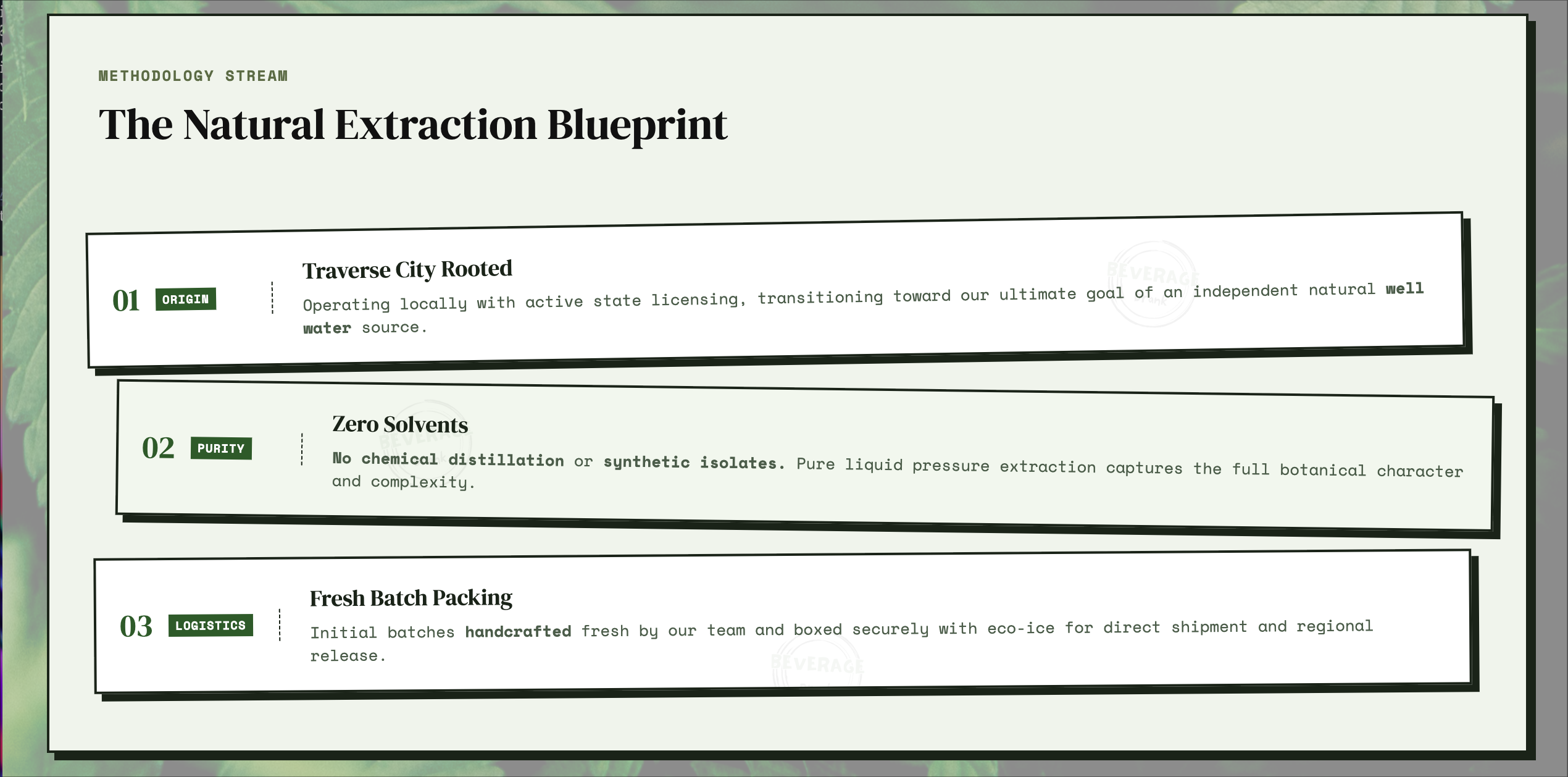
The visual language borrows from editorial print design - cards sit at slight rotations (rotate(-0.8deg), rotate(0.6deg)), borders are heavy and dark, box-shadows are offset rather than diffused. The type pairing is DM Serif Display for headings and Space Mono for body text, both at home in a zine or magazine. The goal was to signal craft and intention without looking like a Shopify template.
Ticker Bar & Logo Animation
A continuous-scroll marquee at the top of the page surfaces key brand signals - solvent-free extraction, October 15 launch, local availability - as the user loads the page. It uses a pure CSS @keyframes animation on a doubled element to create the seamless loop without JavaScript. On mobile, the nav logo plays a roll-in animation on load - a separate keyframe path tuned for the smaller breakpoint.
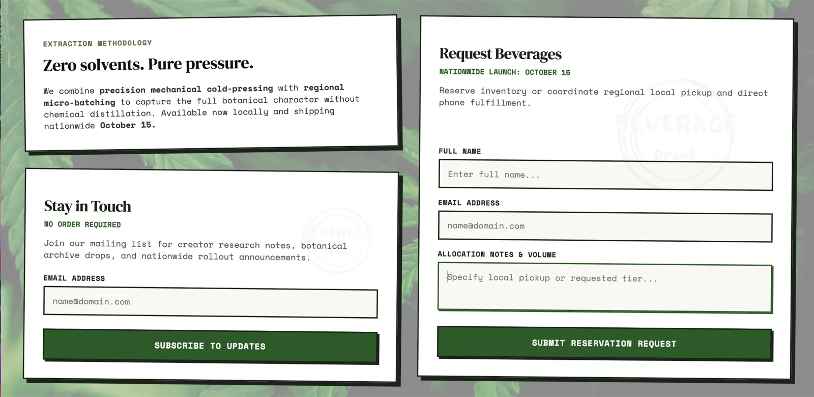
Email Capture & Allocation Form
Two forms serve different audiences: a newsletter form for early customers building anticipation for the October launch, and an allocation/reservation form for wholesale partners and distributors to signal interest before inventory is committed. Both forms are positioned to convert the two main visitor types the client cared about most.
Technical Implementation
Three.js Integration
Each 3D viewer is a separate Three.js scene mounted to its own div container. Models load via GLTFLoader, are scaled and centered relative to their bounding boxes, and use OrbitControls restricted to horizontal rotation so the models spin naturally on drag. Scenes are rendered in a shared requestAnimationFrame loop for efficiency.
Parallax
The background parallax is calculated from mousemove coordinates normalized to the viewport center - no library. On mobile, where there's no cursor, the effect falls back to the CSS breathing animation alone so the page still feels dynamic.
Mobile-Specific Logo Animation
On narrow viewports the nav logo runs a roll-in animation on load - a separate keyframe path that felt better than the desktop static fade given how much smaller the nav renders at that breakpoint.
No Framework, No Build Step
The entire site is vanilla HTML, CSS, and JavaScript with a single CDN import for Three.js via an import map. Deployment is a Vercel static deploy - no server, no build process, nothing to break.
The Outcome
Built and deployed in 5 days - no framework, no template, no CMS. Three.js 3D model viewer, animated parallax background, scroll shake and reveal, a full zine design system, and two conversion forms targeting two different audiences. The client now has something to open in front of investors, wholesale partners, and influencers at any time. Designed and built solo.
Need a website for your business? I take on select freelance web projects.
Let's talk →